Introduction
This week, I reflect on my predictive models for the 2024 presidential elections based on the actual electoral results from November 5, 2024. I assess the accuracy of my predictions with a focus on their shortcomings and also describe some potential improvements that I would implement to my models in hindsight. Please note that the reported electoral outcomes are current as of the date of this reflection’s writing (November 13, 2024).
Where We Left Off
Please visit this link to read my full methodology and predictions for the recent election. I also had the opportunity to publish my predictions for the Harvard Political Review (HPR): I co-wrote this article with my classmates and fellow HPR Masthead members Avi Agarwal and Alex Heuss. Be sure to also check out their incredible work!
To summarize, I created two multivariate OLS regression models to predict both the national two-party popular vote and the outcomes of 13 select state races. My national model included Q2 GDP quarterly growth, weighted national October polling averages, partisan affiliation, and incumbent status. My state model included lag vote share, weighted state-level October polling averages, and incumbent party status.
Using my models, I predicted that Vice President Harris would win 51.96% of the national popular vote and sweep all seven swing states on her way to an Electoral College victory with 319 electoral votes.
My lower bound at the 95% confidence level predicted that former President Trump would earn 52.54% of the national popular vote and win all the selected state races except New Hampshire, New Mexico, and Virginia.
My upper bound predicted Harris to win 56.47% of the national popular vote and win all 13 selected state races.
Accuracy of My Models
How accurate were my models? In short, not very.
National Model
To start with my national model, the visualization below has four main points: my prediction for the Harris’ national two-party popular vote share (black dot), the upper and lower bounds of my prediction interval, as well as the actual vote share for Harris (gold dot). The red dashed line represents 50% of the national two-party popular vote.
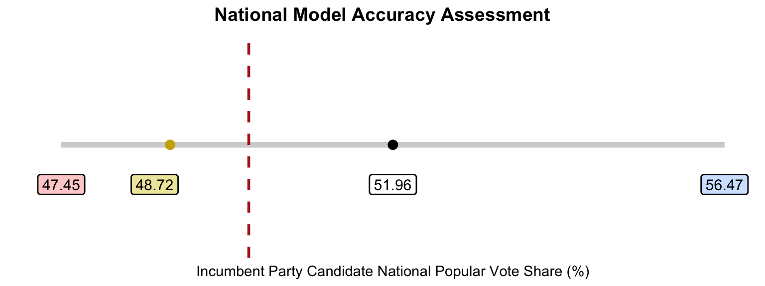
As such, my prediction over-estimated the national popular vote share for Harris by 3.25%. However, the actual electoral outcome still falls within the lower bound of my prediction intervals. Again, I add the dashed line to demonstrate that my original prediction intervals crossed over 50%, suggesting the tight nature of the contest for the national popular vote.
State Model
Next, I assess my state model. The following table presents my predictions for Harris’ popular vote share in the 13 selected state races, as well their respective actual results. The error is calculated by subtracting my predictions from the real-life outcomes. Here, the states are ordered by largest to smallest error (in terms of absolute value).
| State | Prediction | Result | Error |
|---|---|---|---|
| Florida | 49.39 | 43.38 | -6.01 |
| Texas | 48.15 | 42.98 | -5.17 |
| New Hampshire | 55.63 | 51.41 | -4.22 |
| Arizona | 51.21 | 47.15 | -4.06 |
| Nevada | 52.32 | 48.38 | -3.94 |
| Michigan | 52.49 | 49.30 | -3.19 |
| Pennsylvania | 52.16 | 48.98 | -3.18 |
| North Carolina | 51.21 | 48.30 | -2.91 |
| Virginia | 55.73 | 52.85 | -2.88 |
| New Mexico | 55.83 | 53.00 | -2.83 |
| Minnesota | 54.90 | 52.17 | -2.73 |
| Wisconsin | 52.21 | 49.53 | -2.68 |
| Georgia | 51.43 | 48.88 | -2.55 |
Since all the error margins are negative, my state model likewise over-estimated the electoral outcomes in favor of Harris. Florida, Texas, and Arizona had the greatest errors, while Minnesota, Wisconsin and Georgia had the smallest errors. In terms of state calls, my model was correct in predicting that Harris would win Minnesota, New Hampshire, New Mexico, and Virginia and Trump would Florida and Texas. However, I incorrectly called the remaining 7 races for Harris — my model unfortunately did not foresee a Trump sweep of the swing states.
Below is also a summary table of the bias, root mean squared error, and mean average error for my state model.
| Bias | RMSE | MAE |
|---|---|---|
| -3.57 | 3.71 | 3.57 |
These measures are not great given how close recent presidential elections have been — more than 3 points can be the difference between a candidate winning or losing the state.
I also plot my predictions with their intervals along with the actual state outcomes in the following visualization. Again, the black dot represents my prediction, the gold dot represents the actual result, and the gray line symbolizes my prediction interval. The red dashed line is at 50% of the state-level popular vote.
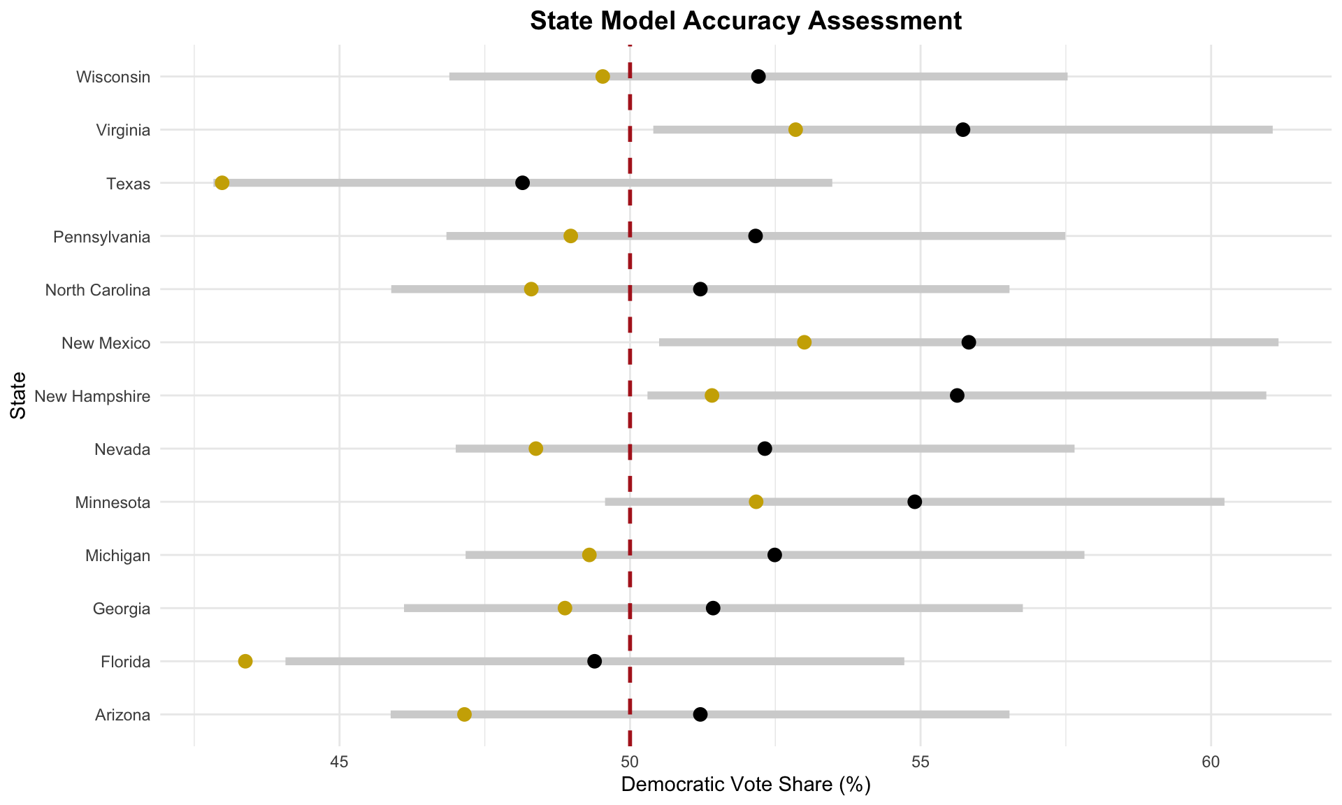
Similar to the national model, most of the actual state outcomes fall between the lower bound of my prediction interval and my prediction. The only exception is Florida, where Harris performed worse than the lower bound presented by my state model.
Additionally, I created a plot to show the differences between the predicted and actual win margins with my prediction intervals. A negative win margin favors Trump, while a positive win margin favors Harris. The color coding remains the same, and the red dashed line is at 0% here, which would suggest a tie in the state race.
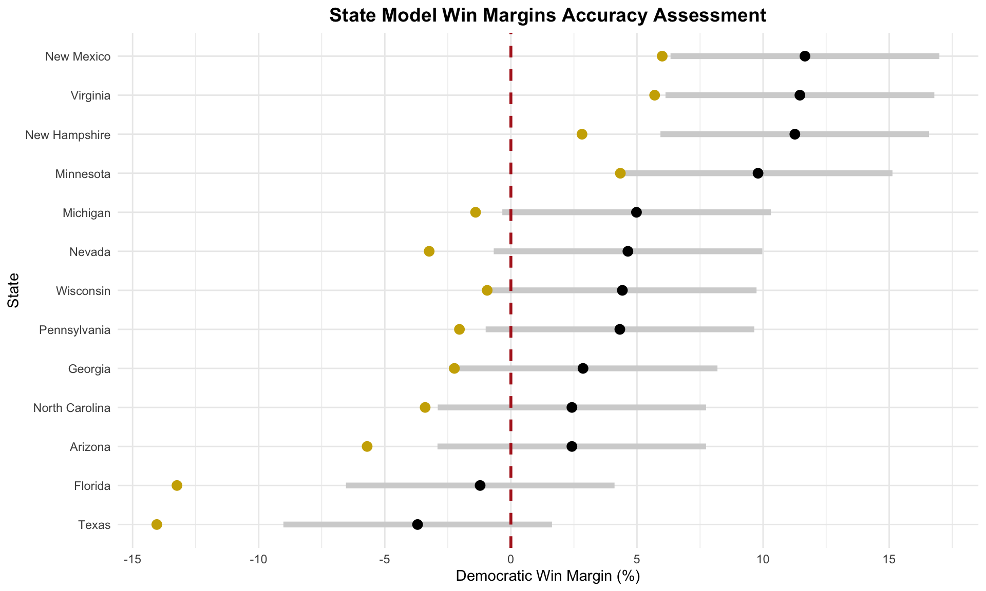
As another indication of my model’s Democratic lean, nearly all of the actual election outcomes are more negative — leaning Republican — compared to my model’s predictions. In many cases, the actual win margins fall outside of my model’s prediction intervals, consistently favoring Trump over my estimates. Particularly, in Texas and Florida, the Republican win margins exceeded the lower bounds of my predictions by nearly 5%, which highlights a significant underestimation of Trump’s performance in these states.
Proposed Hypotheses & Potential Tests
So, what went wrong with my models?
Hypothesis 1: Underestimating the Economy
The economy played a significant role in shaping voter preferences during this election cycle, as voters went to the ballot box with economic concerns top of mind. “It’s the economy, stupid!” and apparently I didn’t heed that time-tested slogan. I believe my models may have relied too heavily on polling data at the expense of integrating key economic indicators. While both my national and state models included polling data, only the national model incorporated an economic measure (Q2 GDP growth) and I did not include a measure to account for attitudes towards inflation. Given that state-level economic factors likely influenced voting behavior more directly than national forces, including another economic variable in the state model may have better captured local dynamics and reduced some of the prediction error. To test this hypothesis, I could obtain state-level economic data — such as monthly unemployment rates or wage growth during the election year — and examine their relationship with actual state-level vote shares. I could also have tried to add Consumer Price Index (CPI) to the national model.
Hypothesis 2: Polling Democratic Bias
Another consideration is the tendency of polling data to overestimate Democratic vote share. This was the case in past elections: in 2020, for example, horse-race polls leading up to the election consistently overstated support for President Biden. As Eliot Morris noted in late October, polling error could have swung the election comfortably for either Trump or Harris — which Trump then went on to demonstrate. Although the numbers are still coming in, the polls appear to have underestimated support for Trump by approximately 3 points nationally. This polling over-estimation likely contributed to my model’s overly optimistic outlook on Harris’ performance in this election. In hindsight, a more balanced approach might have been to give greater weight to fundamentals in my models rather than polling, which doesn’t always align with the realities of voter turnout and preferences. I think there’s also a question here about how to aggregate and weigh polls. To investigate this hypothesis, it may have been worthwhile to utilize polling aggregates from Real Clear Politics — which uses a simple average of its polls — rather than FiveThirtyEight.
Improvements for Next Time
If I were to re-run my model, my main priority would be to place greater emphasis on state-level economic indicators — such as unemployment rates and income growth — to better capture local conditions of concern to voters. This adjustment would hopefully address the limitations of only using a national economic metric, allowing for a more comprehensive understanding of how the economy affects voting behavior. In terms of additional variables, I would also try to incorporate voter turnout in my models, especially given the interesting numbers now coming in on turnout for the Democratic party from this election cycle. Furthermore, I think it would be interesting to consider the role of other down-ballot races on the outcome of the presidential contest: we know now that the Republicans are likely going to control both legislative chambers in addition to the White House and the trends in split-ticket voting are interesting — perhaps there’s merit in trying to forecast the presidential election given its broader political context.
Alas, the time to forecast the 2024 presidential election has come and gone. While election forecasting is far from a perfect science, I thoroughly enjoyed the challenge and gained incredible insights from reflecting on my predictions. I look forward to continue analyzing the election results!