Introduction
Whether it’s at the party or candidate level, nearly every forecasting model includes some measure of incumbency. Incumbent politicians are often understood to have an “advantage” over their challengers: they can harness the “bully pulpit” to command media attention and shape public opinion, get a head start on campaigning, and utilize the powers of their offices (e.g., control spending) to gain constituent favor. However, how does this so-called advantage fare in the face of an increasingly polarized electorate, questions of blame attribution, and incumbency fatigue? In this blog, I aim to incorporate and assess the value of incumbency in my predictive model for the 2024 presidential election. In addition, I also explore expert models for the 2020 presidential election — the Cook Political Report and Larry Sabato’s Crystal Ball specifically — to determine the accuracy of such predictions.
Descriptive Tables of Incumbent Advantage
I’ll begin with incumbency, especially as it relates to the upcoming election The 2024 race presents an interesting, unprecedented question for forecasters: can we truly classify either former President Trump or Vice President Harris as an incumbent? For this blog, I’ll focus on Harris’ claims to incumbency: she is running as a candidate of the incumbent party as well as a vice president (VP).
This first table displays statistics for the success of past incumbent party candidates. “TRUE” indicates that the incumbent party was re-elected, while “FALSE” indicates that the incumbent party candidate lost the election. Out of 18 elections, the incumbent party has only won 8 contests (44%) — less than half.
| Incumbent Party Re-Elected | Number of Elections | Percentage |
|---|---|---|
| FALSE | 10 | 55.56 |
| TRUE | 8 | 44.44 |
Although VPs (both former and sitting) have only competed in six general elections since the 1960s, looking at their past success may shed some light on Harris’ bid.
| VP Elected | Number of Elections | Percentage |
|---|---|---|
| FALSE | 4 | 50 |
| TRUE | 4 | 50 |
Based on the following table, 5 VPs have won their elections, while 5 lost. It’s important to note here that the 1968 election is counted twice: both Richard Nixon (Dwight D. Eisenhower) and Hubert Humphrey (Lyndon B. Johnson) previously served as VP. The record only gets worse when considering the success of sitting VPs: as Politico notes, only one incumbent VP — George H.W. Bush in 1988 — who ran to directly succeed the president they served has been elected in the modern era. Therefore, when examining historical incumbency trends alone, Harris faces an uphill battle against the “curse of the incumbent vice president.”
Combined Regression Model (Economic Fundamentals & Polling)
However, incumbency is far from the only factor in election outcomes. In this section, I begin to combine elements from several previous blogs to create a singular predictive model for the national two-party popular vote share. On the topic of incumbency, this model predicts the national two-party popular vote share for the incumbent party candidate — Harris in this case. This ordinary least squares (OLS) regression model has four coefficients: GDP quarterly growth in Q2 of the election year, RDI quarterly growth in Q2 of the election year, the incumbent party candidate’s September national polling average (weighted by weeks left before the election), and incumbent (for incumbent president). As noted previously in Blog 2, I exclude 2020 from this analysis because of the economic effects of the COVID-19 pandemic The regression table for this combined model is below.
| National Popular Vote Share for Incumbent Party Candidate | ||||
|---|---|---|---|---|
| Predictors | Estimates | std. Error | CI | p |
| (Intercept) | 31.62 | 4.03 | 22.33 – 40.91 | <0.001 |
| GDP growth quarterly | 0.67 | 0.23 | 0.15 – 1.19 | 0.018 |
| RDPI growth quarterly | -0.58 | 0.29 | -1.26 – 0.10 | 0.083 |
| sept poll | 0.42 | 0.10 | 0.19 – 0.65 | 0.003 |
| incumbent | 0.05 | 1.39 | -3.16 – 3.26 | 0.972 |
| Observations | 13 | |||
| R2 / R2 adjusted | 0.876 / 0.815 | |||
Based on this table, Q2 GDP quarterly growth and average national September polling are relatively strong predictors of the national two-party popular vote share for the incumbent party candidate. On the other hand, Q2 RDI quarterly growth is a marginal predictor but lacks strong statistical significance. Incumbency status has no significant effect on the vote share. With R-squared values over 0.8, the model overall seems to be a good fit for the incumbent party candidate’s national two-party popular vote share.
I then utilize this model to predict Harris’ expected vote share for 2024. This combined model of economic fundamentals and September national polling predicts that Harris will win approximately 53.4% of the national two-party popular vote, which is slightly higher than Biden’s 51.3% from 2020.
| Prediction | Lower Bound | Upper Bound |
|---|---|---|
| 53.38 | 47.43 | 59.32 |
Assessing Expert Predictions for 2020
Next, I turn to expert predictions. This blog assesses models for the 2020 election from Cook Political Report and Sabato’s Crystal Boll, which are both generally well-respected and reputable. The two models utiltize similar scales to predict election outcomes on the state level: Cook Political Report uses a 7-point scale (Safe Democrat, Likely Democrat, Lean Democrat, Toss Up, Lean Republican, Likely Republican, Safe Republican), and Sabato uses a similar 6-point scale that excludes “Toss Up” and replaces the term “Safe” with “Solid.”
2020 Maps
First, I plotted maps of the 2020 predictions for both models, as well as the election’s actual electoral map.
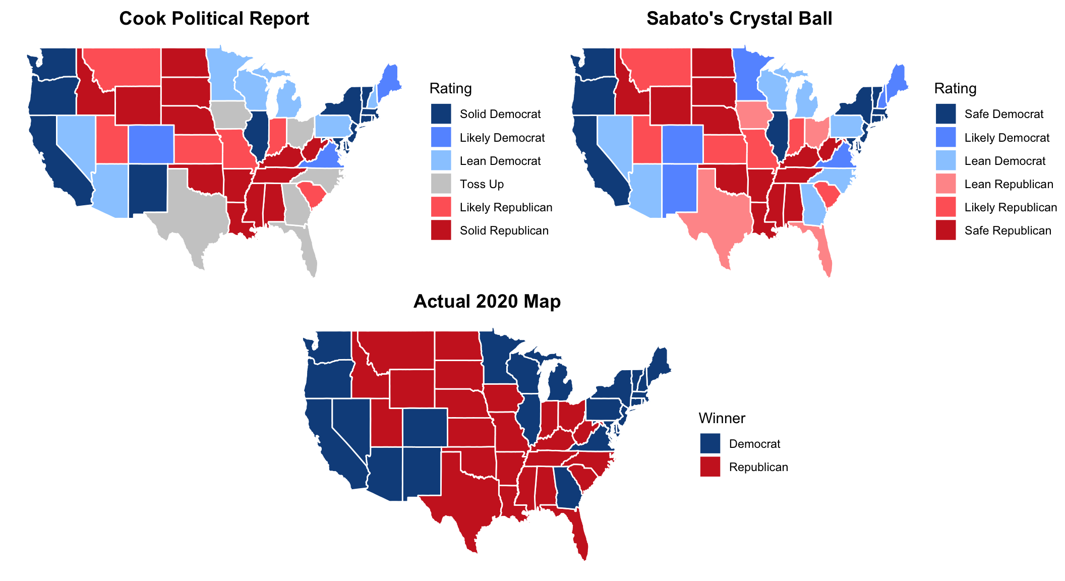
Again, Cook Political Report designates some states as “Toss Ups” while Sabato doesn’t. Another interesting note is that Cook Political Report doesn’t classify any states as “Lean Republican” for its 2020 predictions.
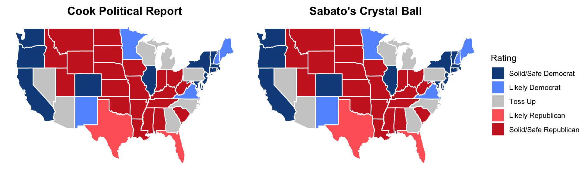
Mismatches between Cook Political Report & Sabato’s Crystal Ball
Let’s take a closer look at the differences between the models themselves before turning to the accuracy of their predictions. The following table presents the states where the two models have different predictions.
| State | Cook Political Report | Sabato's Crystal Ball |
|---|---|---|
| Florida | Toss Up | Lean Republican |
| Georgia | Toss Up | Lean Democrat |
| Iowa | Toss Up | Lean Republican |
| Minnesota | Lean Democrat | Likely Democrat |
| New Hampshire | Lean Democrat | Likely Democrat |
| New Mexico | Solid Democrat | Likely Democrat |
| North Carolina | Toss Up | Lean Democrat |
| Ohio | Toss Up | Lean Republican |
| Texas | Toss Up | Lean Republican |
There are only 9 differences in state ratings between the models, 6 of which are Cook Political Report’s “Toss Up” states. One category (e.g. Lean vs Likely Democrat) separates each of the differences, which calls into question exactly how these models distinguish between each rating. Also, how would Sabato’s Crystal Ball look different if it added a “Toss Up” category?
How Accurate Were These Expert Predictions?
Given the models’ differences, it’s important to analyze their predictive accuracy. To do so, I merge the expert predictions with state-level two-party popular vote data: a prediction is “correct” if it designated a state won by Biden as “Lean/Likely/Solid/Safe Democrat” and/or a state won by Trump as “Lean/Likely/Solid/Safe Republican.” For simplicity, all of Cook Political Report’s “Toss Up” states are counted as misses.
| Model | Percent Correct |
|---|---|
| Cook Political Report | 88.24 |
| Sabato's Crystal Ball | 98.04 |
According to this table, Cook Political Report and Sabato’s Crystal Ball had 2020 accuracy rates of approximately 88% and 98%, respectively. That is high! It’s important to once again note that this calculation is slightly biased against Cook Political Report because it counts all the “Toss Up” states as incorrect.
What Did They Get Wrong?
So, where did the models go astray?
First, all the states that Cook Political Report got “wrong” were designated as “Toss Up.” This table shows the misses for Cook Political Report’s 2020 model: “Margin” is the difference between Biden’s percent of the state’s two-party vote share minus Trump’s, and “Winner” indicates the candidate that ultimately won the state.
| State | Rating | Margin | Winner |
|---|---|---|---|
| Florida | Toss Up | -3.39 | Republican |
| Georgia | Toss Up | 0.24 | Democrat |
| Iowa | Toss Up | -8.37 | Republican |
| North Carolina | Toss Up | -1.37 | Republican |
| Ohio | Toss Up | -8.15 | Republican |
| Texas | Toss Up | -5.66 | Republican |
Given the close win margin in Georgia and North Carolina, we can give Cook Political Report some grace for classifying those two states as “Toss Up.” However, the win margin in the remaining 4 states is relatively high — Florida, Iowa, Ohio, and Texas are all better classified as Lean/Likely Republican.
I do the same for Sabato’s Crystal Ball.
| State | Rating | Margin | Winner |
|---|---|---|---|
| North Carolina | Lean Democrat | -1.37 | Republican |
Sabato only predicted one state incorrectly: North Carolina. We know now that North Carolina was an extremely close race, so perhaps this model would have been better off calling the state as a “Toss Up.”
Conclusion
Thus, incumbency and expert predictions are both interesting factors to look at when considering election outcomes. In more ways than one, we’re still grappling with questions about both topics for the 2024 race. Do we think that either candidate has an “incumbent advantage?” If so, how influential are the effects of their incumbency? On another note, how predictive will expert models be for this year? Interestingly, the state predictions from Cook Political Report and Sabato’s Crystal Ball look awfully similar for 2024.
At the time of this blog’s writing, both expert models have the same exact calls for all states, with the exception of NE-02 (“Lean Democrat” by Cook Political Report and “Likely Democrat” by Sabato’s Crystal Ball). Only time will tell if these predictions are correct, and I’m excited to continue building my predictive model as we get closer to November 5.